Discussion
Loading...

Post

Log in
  • Sign up
  • About
  • Code of conduct
  • Privacy
  • Users
  • Instances
  • About Bonfire
Дими́трий
Дими́трий
@saltywizard@beige.party  ·  activity timestamp 4 days ago

@pdimagearchive

Reposting with #alttext

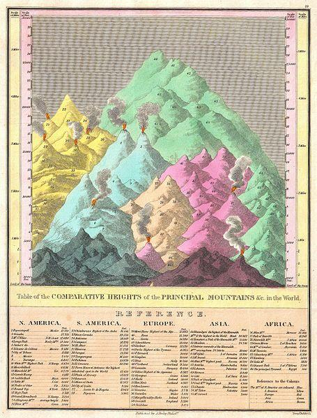
Table of the Comparative Heights of the Principal Mountains in the World (ca. 1826).

Source: Geographicus Rare Antique Maps / Wikimedia Commons

https://pdimagearchive.org/images/f9204fc9-f295-406a-b8b6-7742aaa25f91

#maps #charts #cartography #mountains #geography #continents #art #publicdomain

A bar chart, but the 'bars' are illustrations of mountains and they are crowded together on the page and overlap, with the smaller mounts in front of the larger ones. There is a scale along the left and right edges of the chart indicating the height of each peak. The mountain are in pastel colored groups, presumably according to geographic region. Each peak is numbered and there is a legend at the bottom of the chart with the names of the peaks according to the number. Volcanic peaks are illustrated with a fiery plume at the top and smoke drifting up.
Public Domain Image Archive

Table of the Comparative Heights of the Principal Mountains in the World (ca. 1826)

Table of the Comparative Heights of the Principal Mountains in the World; Finley’s attractive c. 1826 map of the comparative heights of the principal mountains of the world.
  • Copy link
  • Flag this post
  • Block

Indieweb Studio

This is a relaxed, online social space for the indieweb community, brought to you by indieweb.social.

Please abide by our code of conduct and have a nice time!

Indieweb Studio: About · Code of conduct · Privacy · Users · Instances
Bonfire social · 1.0.2-alpha.7 no JS en
Automatic federation enabled
Log in Create account
  • Explore
  • About
  • Members
  • Code of Conduct