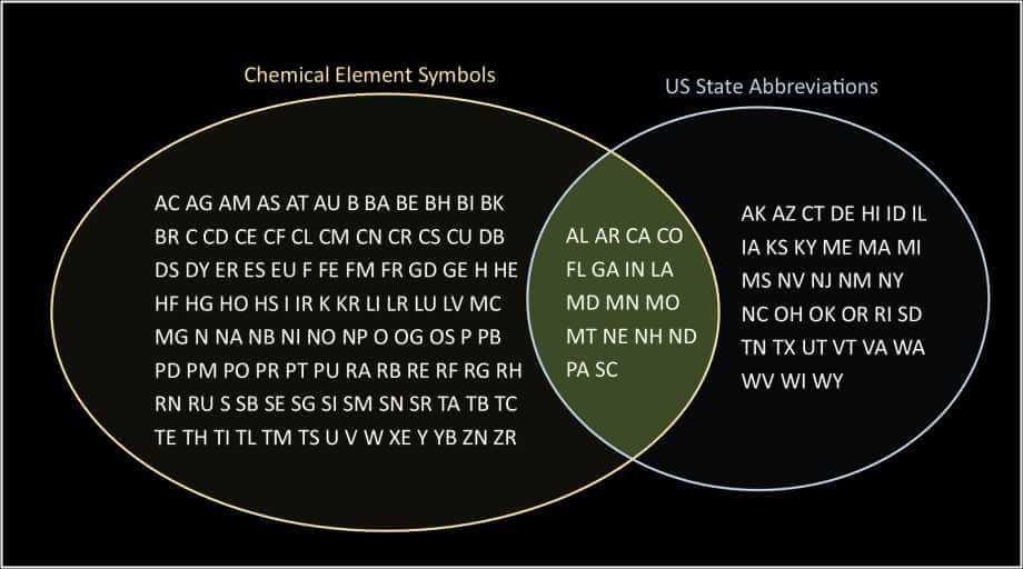
Information Is Beautiful @infobeautiful@vis.social · activity timestamp 2 days ago Because…why not? Read more Read less Translate Translate alt A graphic titled "States vs. Periodic Table" compares the number of US states (50) to the number of known chemical elements (118) and the number of naturally occurring elements (98). The image uses a stylized periodic table layout where each cell represents a chemical element. Some cells are highlighted or contain text that might relate to the comparison, though the specifics are not fully discernible. The graphic suggests a visual analogy or comparison between the two sets of numerical data. A graphic titled "States vs. Periodic Table" compares the number of US states (50) to the number of known chemical elements (118) and the number of naturally occurring elements (98). The image uses a stylized periodic table layout where each cell represents a chemical element. Some cells are highlighted or contain text that might relate to the comparison, though the specifics are not fully discernible. The graphic suggests a visual analogy or comparison between the two sets of numerical data. Reply Boost or quote Boost Quote You cannot quote this post Like More actions Copy link Flag this post Block
alt A graphic titled "States vs. Periodic Table" compares the number of US states (50) to the number of known chemical elements (118) and the number of naturally occurring elements (98). The image uses a stylized periodic table layout where each cell represents a chemical element. Some cells are highlighted or contain text that might relate to the comparison, though the specifics are not fully discernible. The graphic suggests a visual analogy or comparison between the two sets of numerical data. A graphic titled "States vs. Periodic Table" compares the number of US states (50) to the number of known chemical elements (118) and the number of naturally occurring elements (98). The image uses a stylized periodic table layout where each cell represents a chemical element. Some cells are highlighted or contain text that might relate to the comparison, though the specifics are not fully discernible. The graphic suggests a visual analogy or comparison between the two sets of numerical data.